Accelerate #1: Git Ahead or Git Left Behind
Introducing a new series by taking a slightly different look at public GitHub data.
This article is the first in a new series I’ve decided to work on - Accelerate. Building on themes from my social media posts, this series looks at patterns and data to explore the interplay between technology, business, and policy (especially energy) across major economies. Because growth, done right, makes everyone's lives better.
Why now? Well, after several conversations with peers, I’ve concluded that now is a good time to transition this newsletter away from being (exclusively) a personal account of what I’m working on and toward writing about the topics that really fascinate me. I find that writing about things helps to clarify my own (often wooly) understanding of them too!
I’ll continue to write about my personal progress so that folks who only care about that can simply skip this series.
Europoor
Sometime around the start of 2024, I became aware of the term “Europoor” - it’s a derogatory term used by some Americans and (bizarrely) Brits to convey the vast gap in wealth, innovation and living standards that has opened up between Europe and the US over the last few decades (particularly post GFC).
I wasn’t really bothered about the online name calling - that’s a phenomenon as old as the internet itself and, Lord knows, everyone gives as good as they get. What bothers me is that, putting aside the playground insults, when it comes to innovation, this is a totally valid claim. Europe and the UK are falling behind and, if anything, the problem is getting worse not better.
This isn’t a commentary on whether the US is overall a better place to live and work - that’s a complex topic and there are many, many aspects of life in which Europe/UK rank more highly (I’d highly recommend this piece if you want a balanced view on that) but on the topic of innovation, the US is pulling ahead.1
Since the 2008–09 crisis, US labor productivity has surged by 30% - more than three times the pace recorded in the Eurozone and the UK.
American companies, buoyed by an aggressive culture of risk-taking and heavy R&D spending, have driven GDP expansion by 11.4% since 2019
The US repeatedly produces trillion‐dollar tech giants, while Europe hasn’t birthed a single new firm valued above €100 billion in the last half-century. 2
US investors capture 83% of venture capital in G7 economies.
To bridge this innovation and productivity chasm, the EU is estimated to need an extra €800 billion a year—about 4.7% of its GDP—just to start catching up, with the UK facing similar uphill battles after decades of underinvestment.
And this is to say absolutely nothing of other international competitors like China and India (but let’s save that story for another day).
Yikes! So, is there any, um, good news?
Well, honestly, I love Europe and the UK and I don’t think we should just be giving up and accepting a managed decline of the economy.
There are (despite all the doomers) reasons to be optimistic. It will require major changes in policy, tonnes of new infrastructure, piles of cash and rather a lot of time BUT lots of people are already beginning to push for a more innovative and ambitious Europe! 🔥
Edit: France’s Mistral released this just a few days before I sat down to write this.
With all that said, the rest of this series will be filled out with observations, ideas, solutions and problems as I bump into them.
I’ll try to keep things balanced - some pieces will challenge the Europoor narrative, some might support it and others will be more ambiguous. It won’t always be big-hitting stuff either - some pieces (like this one) will be small gems that aim to make you stop and re-check your assumptions.
So… let’s git to it! (sorry, that was the last Git pun, probably)
GitHub Innovation Dataset
As many of you may know, each year, GitHub releases a report that highlights statistics and trends derived from all the public activity happening on GitHub. The data is explained on the GitHub Innovations site and it’s a really interesting read - it slices the data in lots of ways and gives you a feel for what people are working on, what languages are being used and so on.
After reading through the data, it occurred to me that much of it is presented at the aggregate level (i.e. you can see activity at the country or economy level) and then separately they provide data on the number of users/developers etc.
I downloaded the data, did some of my own processing, charting and found some really interesting patterns. I posted these on Twitter and it was well received by the technical community. I’m going to present the findings here without too much in way of “explanation” as I’d like people to draw their own conclusions.
Like any metric, it’s important to understand the limitations - this data includes public activity only and does not account for:
Private activity/contributions (only ~7% of GitHub repos are public3)
Quality of contribution
Incorrectly labelled location and user data (e.g. users forgetting to update their location when they migrate)
All that is to say that you should be cautious about extrapolating these results to make claims about private activity (which is the majority). Anyway, let’s plow on…
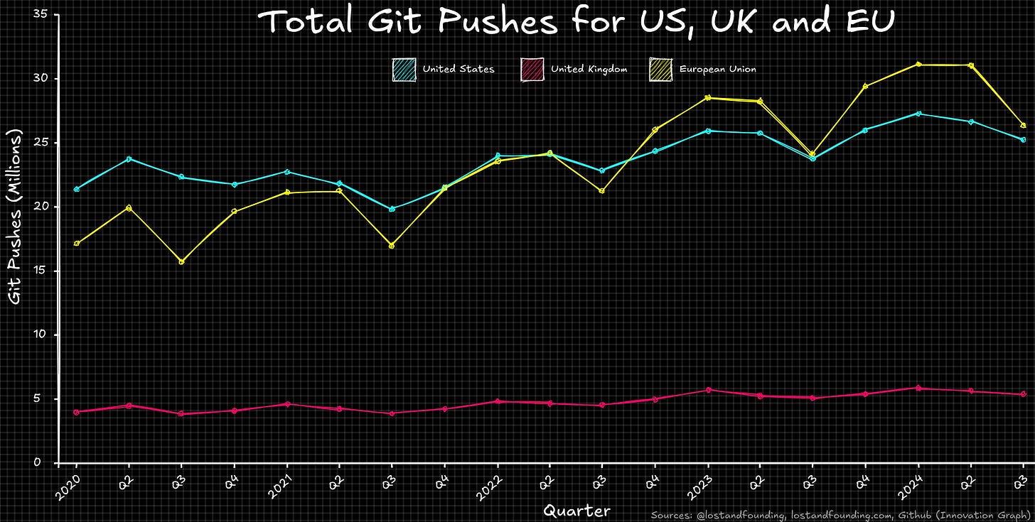
1. Total Git Pushes for US, UK and EU
Typically, activity metrics are published at a per-economy level with the bigger blocs leading in terms of total public activity.
And, that’s exactly what we see when we chart it: 🇪🇺 > 🇺🇸 > 🇬🇧
But, whilst interesting, this doesn’t tell us the whole story…
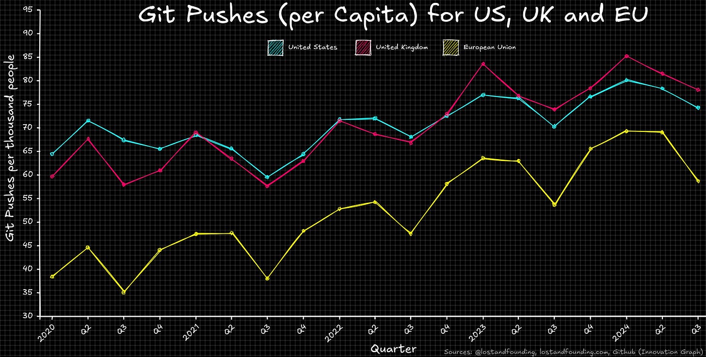
2. Git Pushes Per Capita for US, UK and EU
I gathered the historical population data (via Eurostat, US Census) for the last four years and joined it to the GitHub dataset so that I could see what things look like at a per-capita or per-person level. Note that this is total population and not working age population.
Now you see a different story. The order completely flips so that the Brits are now leading the charge and Europeans rank last: 🇬🇧 > 🇺🇸 > 🇪🇺
So, should we all start drinking English Tea and warm beers? Maybe. Although, again, this isn’t telling us the whole story…
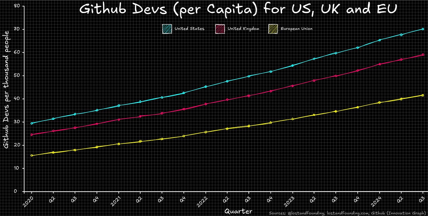
3. Git Devs Per Capita for US, UK and EU
Naturally, the more digital and service-led economies will generally have a larger number of developers per capita. i.e. more tech workers and fewer manual workers. This would give them a positive bias on the previous chart.
We can check this assumption by charting the number of GitHub users (per 1000 people in the population) for each of these economies.
It’s exactly as you’d expect; the most digital economies are on top: 🇺🇸 > 🇬🇧 > 🇪🇺
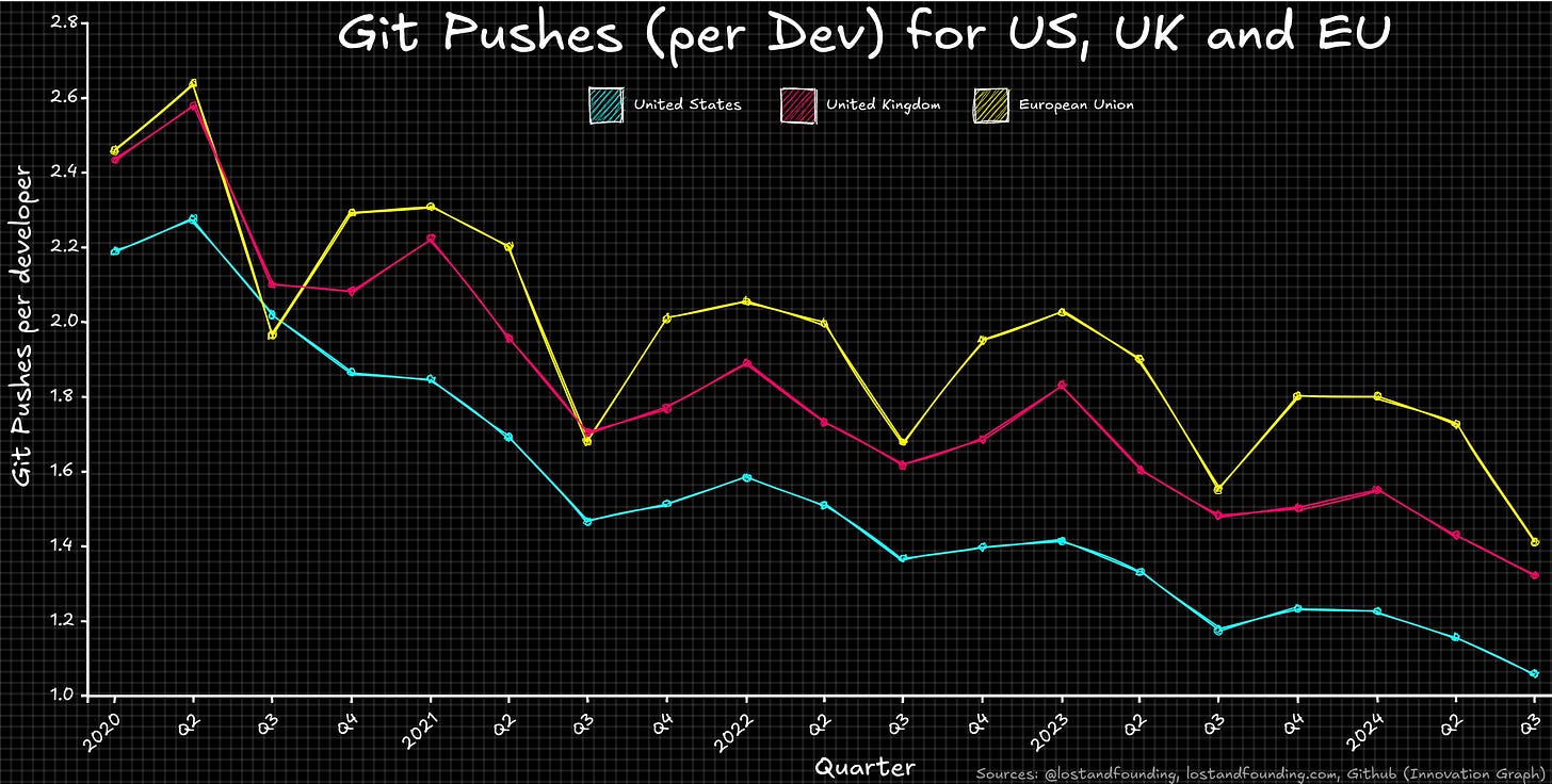
4. Git Pushes Per Developer for US, UK and EU
So, why don’t we look at the activity per GitHub developer? Well, when I joined those two datasets, the ordering switches again and we see that the Europeans are actually contributing more than their US and UK counterparts: 🇪🇺 > 🇬🇧 > 🇺🇸
Holy Crêpes Batman! Despite the stereotype of the mega-industrious US engineering teams, when it comes to public activity, it appears that the Europeans (and to a lesser degree the Brits) are contributing more per engineer than the Americans.
On top of that, regardless of which economy you’re looking at, all three of these economies are pushing less per developer than ever before - that’s definitely interesting. Perhaps people are using multiple accounts or more non-developers are using GitHub for other reasons etc.
Anyway, at the risk of becoming repetitive, I want to say again that there are huge limitations and assumptions baked into this data - I’ve deliberately resisted adding too much opinion to this. Nonetheless, it’s at least worth being aware of this result when reading future reports on this type of activity.
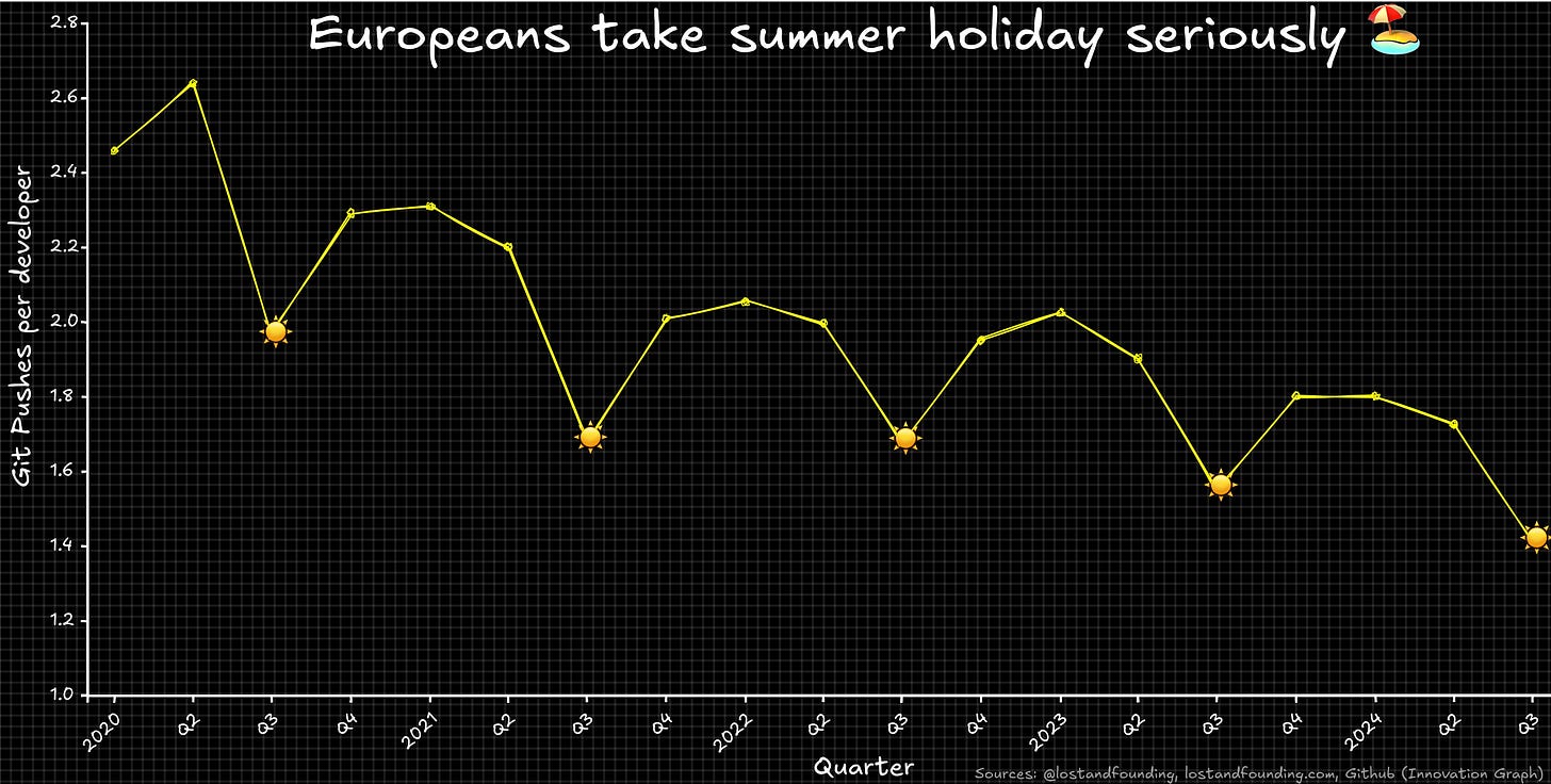
5. Europeans take holiday seriously
Lastly, and just for fun, I couldn’t help but notice the absolutely massive drop in activity that occurs every Q3 in Europe (Jul, Aug, Sep)
In fairness, who wants to write code when it’s 40°C and you need to get to the beach before all the deck-chairs are taken!
P.S. I’ve been asked by a few people how I generated these graphs with the hand-drawn look and feel (à la Excalidraw). It’s actually a custom tool I’m working on which allows D3.js data visualisations to be given the rough/hand-drawn look - when it’s finished I might make the tool available to others but, right now, it’s not user friendly!
Until next time.
Automation Consultancy ⚙️🚀
Codefield helps businesses build and implement automated solutions for an extremely wide range of challenges.
Regardless of sector or size, we find that there are many, many places where leveraging Automation and AI can help businesses reduce (or even eliminate) the time spent on repetitive and/or tedious tasks, allowing them to focus on the more valuable strategic work that takes the business forward.
If you think there are areas of your business that could be automated or streamlined, then feel free to reach out for a friendly (and in no way pushy) chat at automation@codefield.io
https://www.ft.com/content/1201f834-6407-4bb5-ac9d-18496ec2948b
https://www.statista.com/statistics/1078520/top-ten-largest-tech-companies-by-market-cap-europe/
https://www.coolest-gadgets.com/github-statistics/


